Confetti District
A Brand That Celebrates Out Loud
Industry: Experiential / Events / Photography
Services: Brand Strategy, Naming, Visual Identity, Campaign Design, Social Launch, Event Collateral
Year: 2024
Brand Development
〰️
Creative Design Services
〰️
Illustration
〰️
Art Direction
〰️
CPG Product Development
〰️
Social Media Strategy
〰️
Brand Development 〰️ Creative Design Services 〰️ Illustration 〰️ Art Direction 〰️ CPG Product Development 〰️ Social Media Strategy 〰️

The Challenge
Confetti District began as Dru Photo, a photography brand ready to evolve into something bigger, bolder, and more experiential. The founder wanted to move beyond snapshots and step into full-scale creative experiences—immersive, colorful, and impossible to ignore.
Our challenge? Build a brand that captured the same energy, joy, and sparkle of a confetti explosion while giving it the structure and sophistication to grow.
This wasn’t just a rebrand, it was a moment to make a spectacle and reintroduce themselves boldly, and loud.
The Strategy
We started with one simple idea: Life’s Better With Confetti
The new brand needed to feel like stepping into a moment of joy—colorful, clever, and unapologetically fun. The name Confetti District was born out of that energy, a place where creativity and celebration collide.
From there, we built a bold visual and verbal world that embodied “too much” in the best possible way:
The strategy wasn’t just about standing out, it was about showing up loudly.
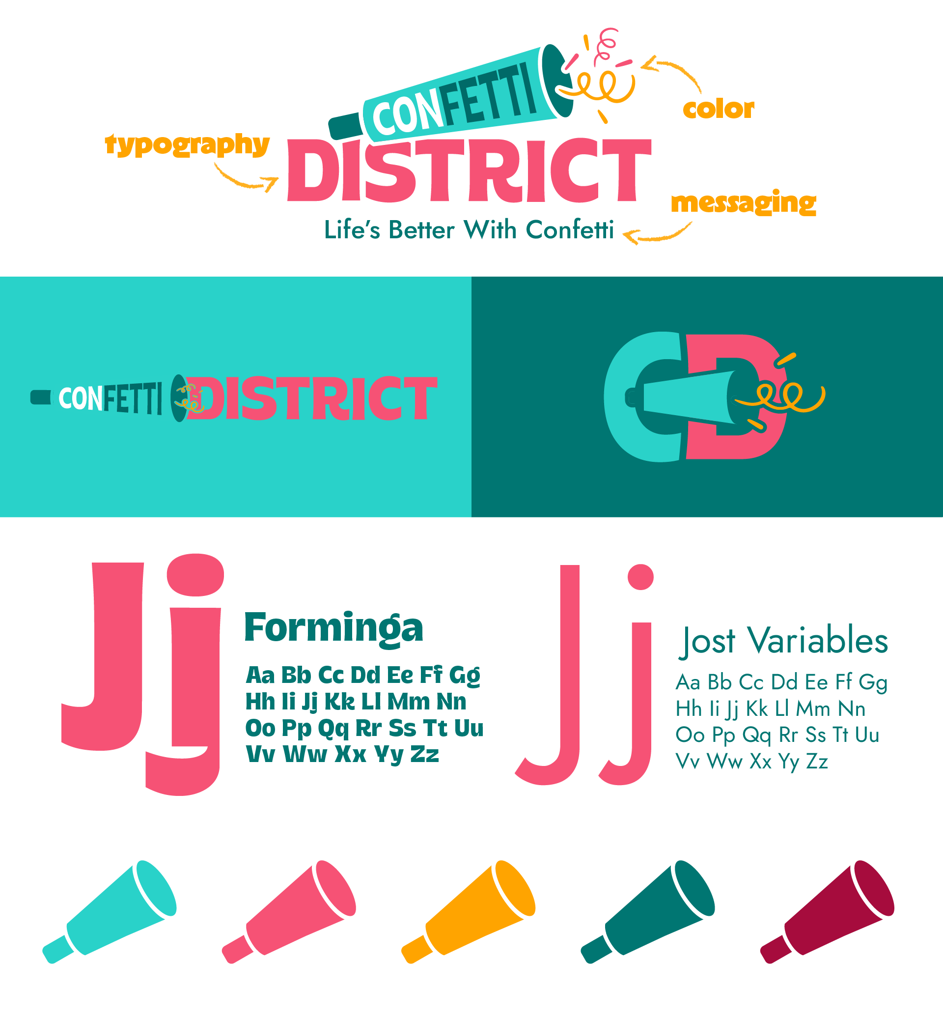
The Visual Identity
The Confetti District identity is a love letter to maximalism.
Each design element—logo, color, type, and texture was crafted to feel like a celebration frozen in time. The logo’s flowing letterforms balance sophistication with whimsy, while the brand textures layer depth, energy, and a touch of chaos (the good kind).
The color palette bursts with saturated pinks, electric blues, and sparkling neutrals, a nod to the “more is more” mindset. A punchy color palette inspired but party poppers and festival lights.
The typography system is bold and confident, giving the brand a voice that shouts joy from every corner. Playful, expressive typography that dances across layouts.
Creative deliverables that feel alive along with copy that sparkles.
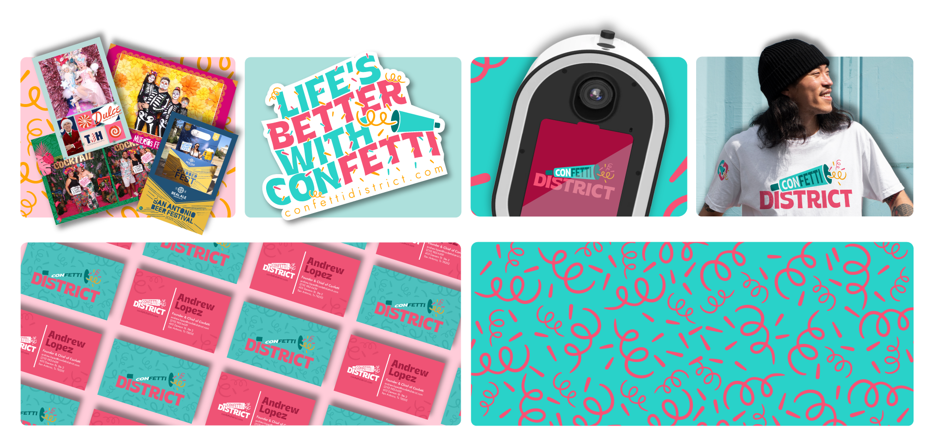
The launch campaign—“Goodbye, Dru Photo. Hello, Confetti District.”—announced the rebrand with color, motion, and emotion.
We carried that energy through:
Brand Identity System (Logo Suite, Color, Typography, Patterns)
Social Launch Campaign & Content Direction
Event Activation & Signage for Festivals
Photo Booth Installation Design
Digital Collateral & Social Templates
Every deliverable was crafted to take up space and celebrate without restraint.
The Launch & Deliverables
The Outcome
Confetti District transformed from a photography business into a fully realized creative experience brand. The rebrand gave the founder a platform to expand offerings, attract new clients, and express their personality more fearlessly than ever.
What started as a simple rename became a full-blown identity—vibrant, strategic, and bursting with character.
Since the launch of the rebrand, Confetti District reported:
160%
revenue increase compared to previous year
10%
increase in new business &
client leads
30%
increase in social media engagement
Reflection
This project is pure Layton Creative energy—bold ideas, strategic order, and a little bit of creative chaos. Confetti District proves that when you stop trying to blend in and start celebrating you’re too much, that’s where the magic happens.